For 2022, the collective refrain in the design world seems to be that the biggest trends reflected a sense of optimism and exuberance. To wit, the year was filled with bold colors, richly textured material palettes, organic forms, and nods to the ’80s. There was also a greater attempt to promote sustainability, whether by landscaping with drought-tolerant native plants or designing homes that relied on fewer fossil fuels.
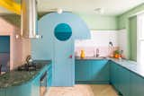
Bold use of color, organic forms, and Postmodern influences were all major players in 2022. In Mo-Tel, a residential project from Studio S&M, for example, the curved blue kitchen larder has a projecting “nose” that illuminates the worktop and a mirrored eye that “winks” each time the door is opened.
There were, however, certain moves that we might be better off leaving behind. Creatives cited materials or architectural features that are worth celebrating in the right context, but have been overused in recent times. Think marble-clad rooms, beige hues, or curvaceous spiral stairs.
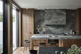
Marble is a beautiful natural material—but one of our industry experts thought it received too much attention in 2022. When sumptuous marble is paired with timber joinery, like in this dramatic kitchen, however, it creates a dark, moody interior, which some think will be a theme for 2023.
Others pointed to more systemic issues within the industry that they would like to see resolved, from a rise in knock-off furniture and greenwashing, to the way social media creates viral trends that lead to oversaturation of certain ideas.
According to the seven industry experts we spoke with, 2023 will be less about checking boxes and more about doing what’s best for the world—and ourselves. We’re excited to see creative reuse and high-performance homes at the top of the list, as well as a passion for dramatic, moody interiors and bold personal expression as a response to homogeneous minimalism.
Michael Fohring—Odami
Loved It: Stainless Steel
“The use of stainless steel as an interior finish has been on the rise for a few years now and has really peaked,” says Michael Fohring, cofounder of Toronto-based architecture firm Odami. “It used to be pretty limited to retail and commercial spaces, but this past year we also started to see it used in residential interiors, which is really unusual and really refreshing—it’s a bit unexpected and super utilitarian, making the home feel much less precious. Unfortunately we haven’t managed to use it in a project, but we haven’t given up hope.”
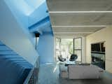
Stainless steel—such as this mesh ceiling—gives residential interiors a utilitarian edge, says Michael Fohring of Odami. It’s a material choice he hopes to use in one of the studio’s own projects soon.
Hated It: Curvy Stairs
“While curvy stairs can be beautiful in the right space, it feels like they became super trendy this year,” says Fohring. “Everyone was using them regardless of how well they worked with the rest of the project.”

A ribbon-like spiral staircase is the perfect fit in this sculptural Australian home by Chenchow Little Architects.
What’s Next: Classic Chrome
“It feels like nostalgia is high for all of us,” says Michael. “Chrome is one of the most traditional finishes for plumbing fixtures—which is maybe why so many designers have avoided it for so long. But it’s due for a comeback.”
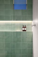
Michael Fohring, founder of Odami, predicts the return of classic chrome bathroom fixtures—such as the chrome tapes set against green hydraulic tiles in this bathroom in Brazil.
Annie Ritz—And And And Studio
Loved It: Cozy Spaces
“Since the pandemic, there has definitely been a movement away from open-concept floor plans,” says Annie Ritz, cofounder of Los Angeles– and Toronto-based interiors and architecture practice, And And And Studio. “All of our clients currently want nooks and crannies, in-between spaces, home offices, libraries, yoga rooms, and even spas.”
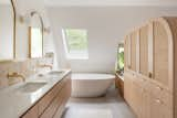
Spa-like bathrooms featured heavily in 2022, a trend Annie Ritz, cofounder of And And And Studio, attributes to a growing desire for cozy, compartmentalized spaces.
Hated It: Marble
“I love marble and, of course, it’s a timeless and beautiful material that is lovely to work with,” says Annie. “It might be controversial, but I feel like we saw a lot of dramatic marble-clad spaces in 2022. It felt like certain marbles went viral and became heavily overused.”
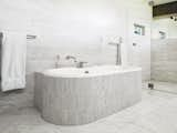
Ritz of And And And Studio sees marble fading out this year.
What’s Next: Moody Interiors
“People are embracing moodier and richer spaces as we enter 2023,” says Ritz. “Without being able to fully pinpoint the exact moment, it does feels like Scandi style has officially left the building. Of course, there are timeless aspects of Scandinavian design and interiors, but wood and white became a default aesthetic for many years.”
“Color is evocative and emotional,” she continues. “For designers, it’s very fun to play with. In the past, we’ve had to convince reluctant clients to embrace color but more people are now a lot more open-minded and eager to work with it.”
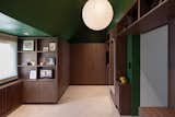
For 2023, Ritz sees a rise in dramatic, moody interiors—such as this walk-in wardrobe in London, which is defined by dark millwork and walls painted in Greenfield by Sherman Williams.
David Godshall—Terremoto
Loved It: Native Plants
“We’ve been happy to witness a huge, exciting transition toward using native plants in built landscapes and gardens that prioritize ecology in their design,” says David Godshall, founder of California landscape architecture practice Terremoto. “This new shift is, frankly, quite awesome and energizing. Given the larger environmental issues we are collectively facing, our office has skewed heavily toward using hyperlocal materials in our gardens and landscapes. Building materials that come from nearby are inherently carbon-light, tell a more meaningful story, and—in an interesting way—build local networks and communities that make our cities and regions more economically self-reliant and strong.”
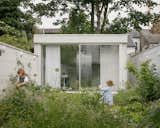
David Godshall of Terremoto is delighted to have seen greater use of native plants and biodiversity in 2022. This garden in London, for example, has been planted with biodiverse turf with multiple native wildflowers species to attract pollinators.
Hated It: Greenwashing
“My least favorite trend would have to be large, ground-up construction projects—that often use a ton of concrete, which has a huge carbon footprint—being hailed as sustainable,” says Godshall. “I think landscape architecture is overdue for a deeper philosophical reckoning in which these giant new projects come into question. Given the magnitude of the crises we presently face, we need to lean more into reuse, reinvention and upcycling. We need to find new ways of making ‘new’ things.”
What’s Next: Creative Reuse
“At the residential level, I see a movement toward gardens that are mostly native, low-tech, and composed of the materials of the garden that existed before,” says Godshall. “The thinking here is that as external resources become increasingly stressed and the climate changes—in California I’d point to the lack of water and increased heat—landscape design can respond with elegance and strength. Building gardens with the principles as I’ve described will make for landscapes that are resilient to these forthcoming challenges.”
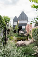
Native gardens and working with existing and reclaimed materials will be big news in 2023, says Godshall. This net-zero passive house in Melbourne features walls built from bricks reclaimed from local construction sites and a native garden with an aquaponic system.
Aranza Garcia—Chuch Estudio
Loved It: Postmodernism
“I would say bold colors, postmodernism, and ’80s influences,” says Aranza Garcia, cofounder of Chuch Estudio, a design practice located in Mérida, Mexico. “I love the SuperDesign movement and would consider postmodernism influences to be my go-to trend—although I don’t like calling it a trend because it’s design history. I think the Ceiba Lamp we designed is a great example [of this approach],” she says. “It combines local clay, reflects the southern Mexican context, and is symbolic of the local ceiba tree.”
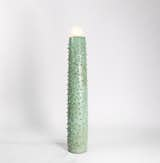
The Ceiba lamp by Chuch Estudio is handmade of clay and mineral oxides. It takes inspiration from the thorny trunk of a ceiba tree and the work of legendary designers Jean Royère and Gio Ponti.
Hated It: Mexican Wabi-Sabi
“I’m not into beige stuff,” says Garcia. “I feel like Mexican wabi-sabi is some kind of appropriation and doesn’t reflect our culture at all.”
Editor’s note: Mexican wabi-sabi is a style of design that combines Mexican craft traditions with the Japanese concept of finding beauty in the imperfect—and it had a bit of a moment in 2022.
What’s Next: Individual Expression
“The post-pandemic era has been a turning point in design,” says Garcia. “People are more conscious about their homes and we all need a space to feel happy in. I’m really excited about individuality. I’m glad so many people are leaning away from simple, minimalist rooms.”
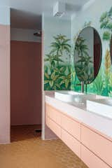
Aranza Garcia, founder of Mexican design firm Chuch Estudio, is excited to see more individual expression in 2023—such as this bathroom in a home by Norwegian architect Margit-Kristine Solibakke Klev that features leafy wallpaper from Etsy retailer AwallonDesign.
Lisa Breeze
Loved It: Color and Pattern
“With interiors, we’ve seen loads of color and it seems the level of comfort with bold and deep tones has really set in,” says Australian architect Lisa Breeze. “These in combination with richly patterned materials like natural stone and colourful terrazzo are becoming a hallmark of the early 2020s.”
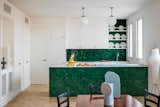
Australian architect Lisa Breeze loved the use of color combined with natural materials this year. Take this Madrid apartment, which features bright yellows, greens, blues, and reds paired with materials like glazed tiles, ceramics, and wood.
Hated It: Replica Furniture
“Seeing replica furnishing and lighting has never been cool and keeps on happening,” says Lisa. “Borrowing and developing ideas is one thing. Making a cheap and nasty copy is another—ideally, we will see an end to that.”
What’s Next: High-Performance Windows
“Here in Australia, there has been a big, sudden shift to get off gas,” says Breeze. “The drive to switch to all-electric homes is not new but with the combined pressures of changes of government and the war in the Ukraine we have seen a real shift in the broader mindset.
“Following on from the push to all electric houses, I see a real uptick in the use of high-performance windows,” she continues. “Personally, I’m keen to explore the use of UPVC window frames for my client’s homes. It’s nothing new globally but only just getting a stronghold in the market here in Australia.”
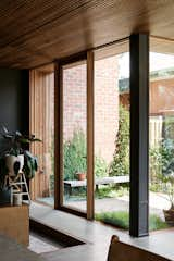
High-performance windows are going to be big in Australia in 2023, says Breeze. This home in Melbourne, designed by Archier, uses high-performance windows and doors by Binq. The architect also made a point of avoiding plasterboard, instead using structurally insulated panels for the walls to create an airtight seal, and a hydronic concrete slab from Hydrotherm that can warm or cool the interiors.
Sean Kim—Wooj Design
Loved It: Style Mash-Ups
“We’ve never had a greater ability to look at design work from the past,” says Sean Kim, founder of New York-based 3D-printed design studio Wooj Design. “As a result, in the past few years, we’ve seen a sort of ‘PoMo’ mixture of eras—midcentury modern neutrals living alongside Memphis style and high-tech in a haphazard juxtaposition.
“I’ve also noticed that in comparison to the late aughts and early 2010s, things have become more exuberant—organic shapes, bright colors, clashing patterns, and lots of references to the 1980s and 2000s.”
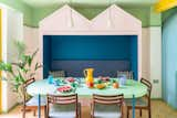
Sean Kim of Wooj Design loves the style mash-ups we’ve been seeing recently. Mo-Tel House by Studio S&M embraces a colourful palette inspired by Memphis style and Postmodernism. These colourful elements are balanced by more subdued Mid-Century Modern pieces, such as the dining chairs.
Hated It: Social Media
“There’s a monotony that I think is caused by social media,” says Kim. “Being obligated to perform on social media makes me want to die of boredom. Designers and artists are going to need to find new ways of connecting with audiences or else all the wonderful variation that makes life fun is going to turn into the same boring monoculture.”
What’s Next: AI Design
“Designers are going to have to push boundaries,” Kim says. “AI is going to be able to come up with a lot of concepts that are passable, at least in the concept stage. Designers are going to either work harder or make use of and learn new tools and methods in order to stay relevant. We’ll really be tested on what our ‘creative’ ideas mean. Overall, I think this is a good thing to stir the pot a little bit.”
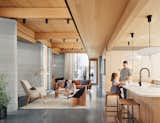
Kim has noticed greater use of 3D-printing technologies. For example, House Zero by Icon and Texas firm Lake|Flato Architects combines Icon’s printing method with traditional building techniques. Going forward, Kim predicts these technologies will be paired with more widespread use of AI.


